Install the app
How to install the app on iOS
Follow along with the video below to see how to install our site as a web app on your home screen.
Note: This feature may not be available in some browsers.
You are using an out of date browser. It may not display this or other websites correctly.
You should upgrade or use an alternative browser.
You should upgrade or use an alternative browser.
New HUD! need help from coders
- Thread starter Nem
- Start date
PureWhoopAss
Legions Developer
some of that is doable, the hard part would be getting the text to skew to match the hud which i think would become an issue. Unfortunately you wont be able to use those health and energy bars in circular pattern.
Arch
Legions Developer
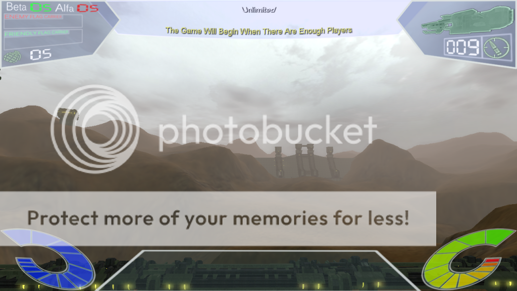
It's the map. The lights on the wires.Wow, love the angle thing with the top corner display objectives, it gives the hud depth.
Also, is that a cOmpass at the very bottom of the screen with the yellow tics?
Nem
Member
Great work! Just a few suggestions and things I noticed:
- You spelt Alpha wrong
- Make the Health & Energy Bars Smaller
i'm a Spanish speaker too ( alpha=alfa ), well in that moment was all about the design

some of that is doable, the hard part would be getting the text to skew to match the hud which i think would become an issue. Unfortunately you wont be able to use those health and energy bars in circular pattern.
Right now i'm getting into CS files to see what i can dig

Nem
Member
well this may help you guys to understand how the animation scrip should work on the energy and health bars,
instead of follow a line or a vector it will be a........ well see it for your self
this might solve the skew text, i mean the video above should show a way to change the " in command line text " for a png image ( every number and word or letter will be an image ), yes! lots of line commands ...i guess.
instead of follow a line or a vector it will be a........ well see it for your self
this might solve the skew text, i mean the video above should show a way to change the " in command line text " for a png image ( every number and word or letter will be an image ), yes! lots of line commands
...i guess.PureWhoopAss
Legions Developer
this might solve the skew text, i mean the video above should show a way to change the " in command line text " for a png image ( every number and word or letter will be an image ), yes! lots of line commands
yes after all said in done with letters and numbers you probably going end up with a thousand lines of code to do simple functions on screen. Good luck my friend

Nem
Member
yes after all said in done with letters and numbers you probably going end up with a thousand lines of code to do simple functions on screen. Good luck my friend
i need a reference guide to know how the code works, i mean what does "%", "::" means ect. and then the sentences to understand the algorithm.
this is a big challenge and most important, i like it! just hope to don't have to drop the towel very soon.....please, help me mate, i'm not doing this for fun, money, or self satisfaction, it's becouse i like it and love to see how it works in game. Any way, cheers up!, and have a nice day my friend.
")
PureWhoopAss
Legions Developer
theres tutorials on torque script and/or database of all the variables.... google it that should help you out
Armageddon
Teapot
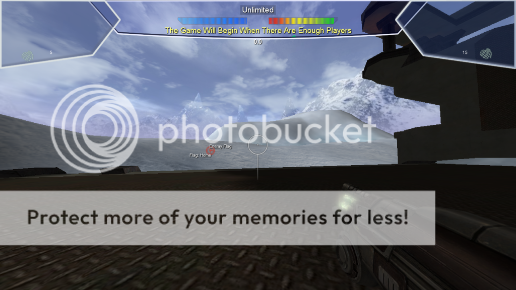
Thats going to take a lot of time if you plan on using images in that way, the game measures health and energy from 1-100%. If you do it to were it rounds up or down then the player will never know for sure how much of each they have, so that idea is out. IMO not worth the time to figure out. But it does look nice.
I
IzRaPiDz
Guest
Absolute brilliant, good work matey!
Nem
Member
thank you guys, i'm getting along with the torque scrip, for now i been modifying the hudElements.cs file on Dreamwever, now i know that every image is a box, uhmm well not a box just a square or rectangle in "2D" and then another little thinks that made think, "i can read the code and understand it !" for now i'll keep skewing images without getting out of the containers to make them match in multiple ways.
Well here it is, a modification that i made to the topFrameContainer and BaseContainer using the script and Photoshop.
It's deeper ( original 1280 x 720 px ).
have a nice day !
Well here it is, a modification that i made to the topFrameContainer and BaseContainer using the script and Photoshop.
It's deeper
( original 1280 x 720 px ).have a nice day !
thank you i'm skewing to WoopAss...loltheres tutorials on torque script and/or database of all the variables.... google it that should help you out
PureWhoopAss
Legions Developer
id get rid of the strokes and use soft glows... also don't overlay the hud elements
Nem
Member
thanx i'm gonna change the blending options i guess the point is to make it look like a transparent holographic display and then make the elements to pop out.id get rid of the strokes and use soft glows... also don't overlay the hud elements
here is a test a bit fun
Arch
Legions Developer
I would suggest on using matching layer styles. All three of the panels look like they have a different style.thank you guys, i'm getting along with the torque scrip, for now i been modifying the hudElements.cs file on Dreamwever, now i know that every image is a box, uhmm well not a box just a square or rectangle in "2D" and then another little thinks that made think, "i can read the code and understand it !" for now i'll keep skewing images without getting out of the containers to make them match in multiple ways.
Well here it is, a modification that i made to the topFrameContainer and BaseContainer using the script and Photoshop.
It's deeper
have a nice day !