Rate the Signature/Avatar Above You!

Status
Not open for further replies.
almost.
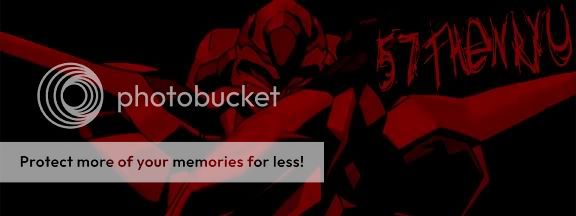
Pic (altered somewhat for different colours + enhanced glow from eyes) + stamps (for the 3d blood effect I believe. I made this almost a year ago I think so it's hard to remember) + text.

9/10 btw.

Edit: that was for A2
Edit2: however I'd also rate yours a 9/10 :D
 
5/10
readability is very low, composition has a nice motion but ultimately has no "presence"
i like the red though... <_<
 
8/10

Mweh, rate this one:
randomsigs42.png
 
I thought it was a dragon with green flames:eek:
However hehe, it takes more time to understand that your sig doesn't have a dragon :D
8/10 I luv green
 
I thought it was a dragon with green flames:eek:
However hehe, it takes more time to understand that your sig doesn't have a dragon :D
8/10 I luv green

You obviously don't know what StarCraft is then.

@Enryu 6/10 You can't read the "57th" tag!
 
@ Sheep: 8.5/10 - I like the lighting and the colour scheme, however, the render doesn't look like it has been changed much at all and the text doesn't really suit. Looks good though!
 
96/10, only fault that I see is its hard to see your name

Not a lot going on either, solid colour background doesn't do it for me. Still, nice render.

Also the name in my sig is supposed to be discrete, glad you didn't notice it instantly :P I considered removing it altogether but my e-penis was too large at the time.
 
Hmmm, something tells me I need to change my sig............OOH, time to go tho one of my old favs XD

Ok, rate that one (not my best but I like it)
 
Status
Not open for further replies.
Back
Top