Install the app
How to install the app on iOS
Follow along with the video below to see how to install our site as a web app on your home screen.
Note: This feature may not be available in some browsers.
You are using an out of date browser. It may not display this or other websites correctly.
You should upgrade or use an alternative browser.
You should upgrade or use an alternative browser.
Rate the Signature/Avatar Above You!
- Thread starter 57thRomance
- Start date
- Status
- Not open for further replies.
57thEnryu
Member
@ 57thEnryu: 8/10 - Looks better small, improves the quality a lot. The text suits the image well, and it's fairly simple, but simple is good if you do it right! I don't recognise the image, if you drew it, you get a 9/10 from me instead
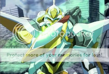
the Lancelot from Code Geass
(don't rate me again (unless u want to), just rate Jazcash)
Vinzyboy23
Member
6/10
I don't appreciate that, dude
EDIT: Smoke Brush you used? I think.
I don't appreciate that, dude
EDIT: Smoke Brush you used? I think.
57thEnryu
Member
Vinzyboy23
Member
I don't really appreciate your sig because it's too dark.
57thEnryu
Member
thats the point, dark=evilI don't really appreciate your sig because it's too dark.
Vinzyboy23
Member
@Jazcash 9/10
Red is good but Blue is better
Red is good but Blue is better
Spartan187
New Member
just like rate that signature except ur rating ppls avatars if they have 1
57thRomance
Member
8/10
Freakyyyy
Freakyyyy
57thRomance
Member
7.5/10
Text doesn't fit too well with sig.
Text doesn't fit too well with sig.
") 9/10
9/10havocblitz
Member
jazcash i luv ur sig! Nice 1 dude!
7/10
7/10
Chi-Ro
Private Tester
If there's question on the point of this thread you could always just run a CnC. Though I doubt you'll have enough people with the ability to take part in that compared to the simplicity of "9/10! Pretty colors!@".
Either way its an alternative that actually has depth and purpose to it.
Also.
4/10
It's a screenshot with some text added.
Either way its an alternative that actually has depth and purpose to it.
Also.
4/10
It's a screenshot with some text added.
- Status
- Not open for further replies.