DKnight556
Member
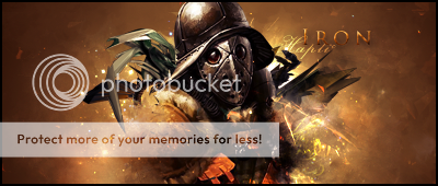
This is my first good sig that i have made ( in my opinon). Can someone give me some pointers to make my next one better?


This website has a lot of tuts and resources that are free and very useful. Check it out. Also, search C4D on DeviantArt. They do have packs too, very nice ones at that.LOLZ
I can't do that sadly. The image was flattened when exporting from gimp.
Does anyone have some good c4ds I can have?
I disagree. Your name/text should go along with your sig; fit into the flow of it. And you don't really want to place a glow around text, just makes it look mediocre. Best thing is to place a nice gradient over the text and some drop shadow effects. Just use a pleasant font that follows the theme of your sig and add a gradient to color the text.I suggest you add your name in white/light glowing blue somewhere in the lower-left part of the signature, below the curve of light in the background.


