Since there is no art/multimedia section....

masterluso

Member
Since there isn't an art/multimedia section to post this in, I'll put it here. I was wondering which fonts you guys like to use in sigs, and how you choose, if there is anything more to it than just "cuz it looks good."

Feel free to post other related Q/A below. :D
 

57thEnryu

Member
I change fonts all the time. the one in my current sig is "anythingyouwant", but I usually look for a font that works online.
 

Dacil

Member
than just "cuz it looks good."
well, since I've been an artist for my whole life and will have 50 so credits by the end of next semester, it is never....never "cause it looks good"....its the art of art bullshit, takes awhile to get good at it ;D
 

57thEnryu

Member
well, since I've been an artist for my whole life and will have 50 so credits by the end of next semester, it is never....never "cause it looks good"....its the art of art bullshit, takes awhile to get good at it ;D
This reminds me of a quote one of my art teachers told me; "If there were such a thing as artistic talent, a slugs track could be considered art". Just because someone made a sig doesn't mean it is art, it has to make sense, it has to look good (in an aesthetic sense). Don't forget, for sigs their intended to portray something about you (wonder what Disci's ment...), so be careful. That is all I have....
 

h2odragon

Member
Just as A2 said, I select a font according to the rest of the sig, if the font doesn't fit the sig itself will look bad.
 

57thPeanut

New Member
I always like looking at similar sigs to the one I am creating, and see what type of font they have used. If your struggling, give it a go.
 

Jazcash

Member
I have about 4500 fonts and I usually find it hard to find the one I want, I usually sift through about 100 before I find the font I want. I rarely use Serif fonts in artistic pieces, in fact, I rarely use Serif fonts at all. I just find Sans Serif fonts more smooth and "aesthetically pleasing". So I guess it's no surprise that I really don't think the font used for posts on this forum work well at all.

Out of all the default fonts, Verdana is my favourite, especially at around 9pt-13pt size. As for titles and things, Myriad Pro is always reliable. A less used but decent "banner/logo" font for games and the like is Microgramma, definitely one of my favourite less classical fonts.

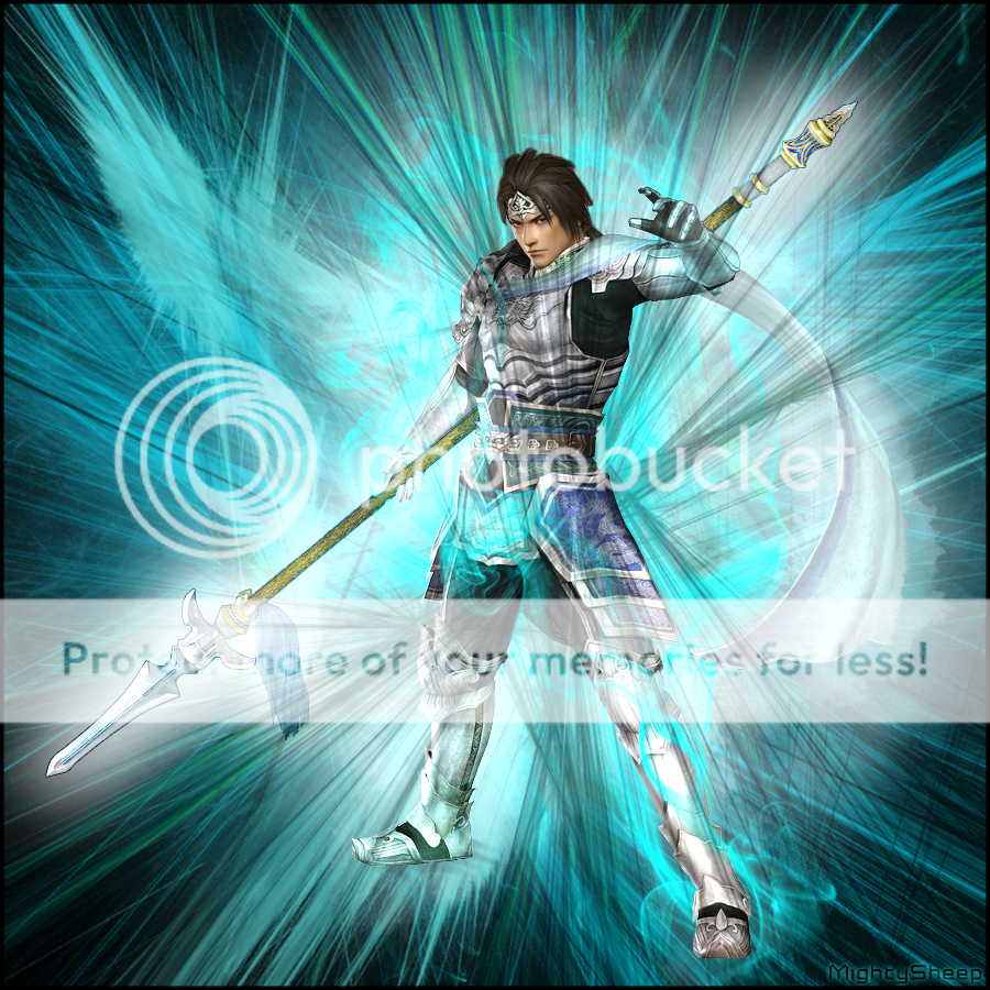
As for signatures, I don't like using large text, if any text at all. If text needs to be seen to make the image what it is, I'll try and differ it more in terms of notability whilst retaining a consistent style in the piece. I don't like differing text styles from the art just to make it stand out. I also tend to keep text a low size in sigs. I haven't actually made any sigs for a long long time but maybe I'll make a few more when there are some new decent Legion renders out ^_^
 

MightySheep

Member
Since there isn't an art/multimedia section to post this in, I'll put it here. I was wondering which fonts you guys like to use in sigs, and how you choose, if there is anything more to it than just "cuz it looks good."

Feel free to post other related Q/A below. :D

lately I've been using Astrolyte alot

and since there is no art/multimedia section, I will post a gfx I made today :)

ZhaoYunFinal.png


It's my fav char from dynasty warriors; zhao yun
 
Top